-
Welcome to Smeargle's Studio! Please be sure to review the studio rules. Feel also free to check out our hub to learn more about this place!Welcome to Smogon! Take a moment to read the Introduction to Smogon for a run-down on everything Smogon, and make sure you take some time to read the global rules.Congrats to the winners of the 2023 Smog Awards!
Normal Drawings
- Thread starter Doomsday
- Start date
I really like the bubbly shading style, and the crocs are my favourite pokemon, the zangoose is cool, but the shading style wasn't pulled off quite as well, you focused too much on the fur I guess.
Also the Zangooses feet are kinda freakin me out.oh what is this is it a huge bump
hey guys. sorry i haven't updated. I actually have been fiddling around a lot with my tablet, and i have drawn lots of shit during this period, but I didnt want to post any incomplete stuff so there's that. here's some crap, though!
this was supposed to be a self-portrait but it ended up as... something else. clearly i draw more with my imagination than with my eyes.
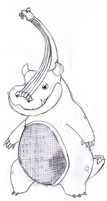
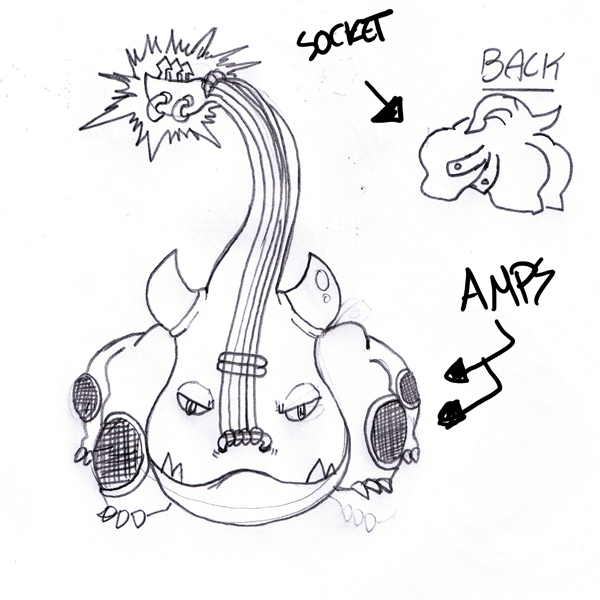
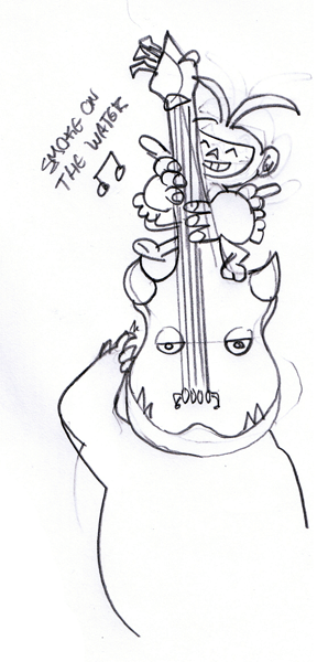
those were my CAP8 submissions. it's supposed to be based on an electric guitar. even though it looks more like a hippo than a dragon, i still think it has a certain charm to it...! pushing modesty out of the window though, i think it's pretty original.
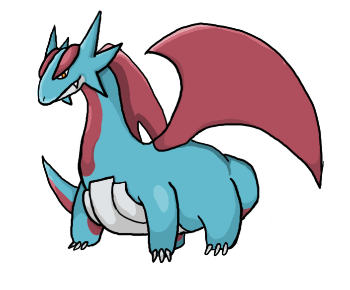
today i went on a limb and thought, FUCK! im ganna draw a salamence. and so i did. see it as some sort of compensation for not doing any requests lately :XThe Feraligatr's definitely one of my favorites. :)
I didn't know you did art.
Thats pretty cool. How did you create the blurred smoky effect? I can paint in Photoshop, that's about it, and alter other pics.It's nice, but the problem I have with this, is that the smoke looks like a background rather than being released from Koffing (but the smoke itself is good).my thoughts are that it doesnt belong in my fucking thread
I painted the outlines first with the darkest shade of smoke-like colors (green, browns, etc) and then painted all over it with different colors. it's hard to explain, i just went apeshit with colorsThats pretty cool. How did you create the blurred smoky effect? I can paint in Photoshop, that's about it, and alter other pics.
Feeling this guitar RHINO.hey guys. sorry i haven't updated. I actually have been fiddling around a lot with my tablet, and i have drawn lots of shit during this period, but I didnt want to post any incomplete stuff so there's that. here's some crap, though!
this was supposed to be a self-portrait but it ended up as... something else. clearly i draw more with my imagination than with my eyes.
Edit: Size of blastoise is overwhelming makes it so much cooler.
CS2 'cuz im badass like that B)5-Star Artworks. I suggest coloring your artwork. What program do you use: CS3 or GIMP?
some more shit
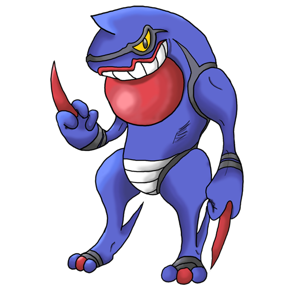
toxicroak! toxicroak is what would happen if joker and wolverine had a kid and that kid was born a pokemon. i didnt think it came out too well but it was nice training. maybe i'll re-do it someday
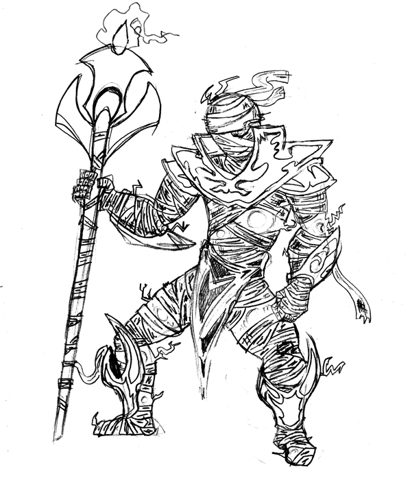
hazerider asked me a pic of prince shaffar from world of warcraft and this was what i came with. i know it looks like it's falling to the left , i made the leg too fatty. i'll probably fix it if i ever color it. nevertheless, i pride myself on this. that is one mighty, mighty badass croagunk, and shaffar looks great too. he looks very solid for an ethereal, but i'm sure you can express that with colouring
man, if you're taking requests, might you try a dragonair looking both regal and badass?
(also i use cs2 too it's the choice of truly great men)
The user Exeguttor? God, he was a Pokemon forum terrorist.maybe you missed this, user with the name so terrible i will not grace it with a mention
I dare you to draw Lapras. Shouldn't be tooo hard... where did this/you goMy favorite is definetly toxicroak or salamence, and have you ever thought about drawing battles... how about salamence vs latios...haven't drawn stuff, i mean i have i just havent scanned it and played around with my tablet. so here's a bit of old school drawings for all.
The first set of drawings are for a 'project' you could say im making. Just a basic trainer/favorite pokemon team sketch. I've done 3 of 6 pokemon so far:
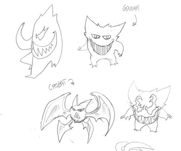
gengar & crobat (dont mind the gengar + venom doodles on the side)
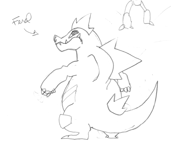
feraligatr. again.
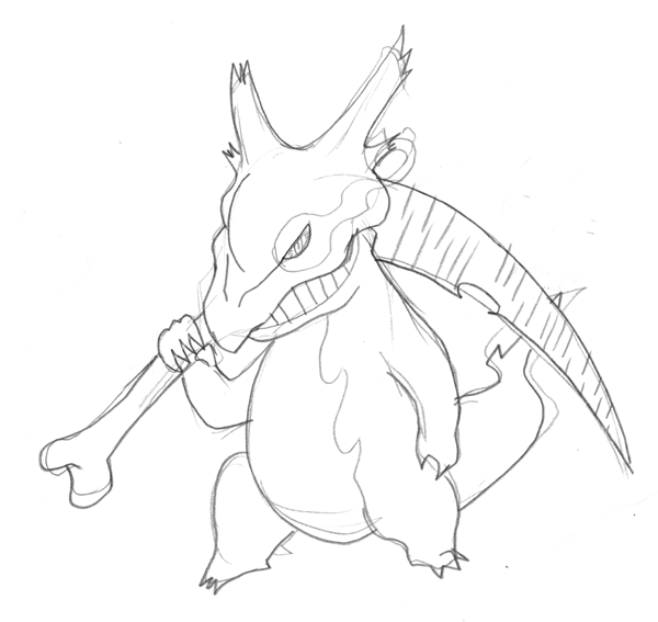
this one is sort of a weird idea i had. what if gengar worked like the venom symbiote does in marvel comics? y'know, kinda like a suit, giving the host enhanced powers and a new, shadier appearance. in this case, gengar's grin and maniacal stare is what gets carried over. i thought that if it somehow made marowak's bone into a full-fledged scythe it would be badass.
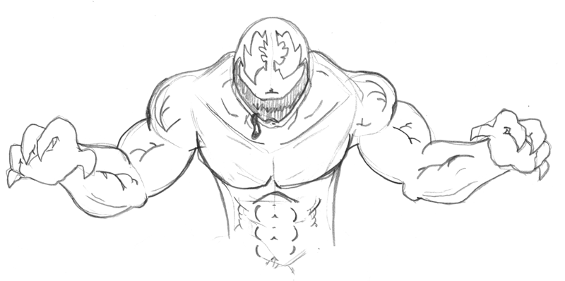
venom grinning.
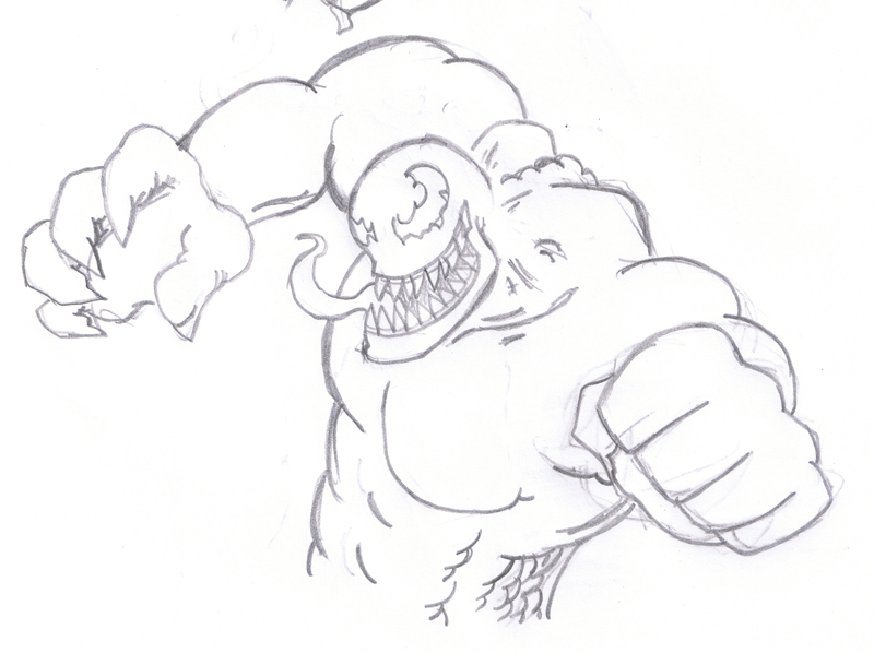
venom punching or dodging or whatever
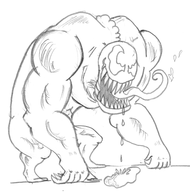
venom drooling
have i mentioned venom gives me a huge hard-on
now to top it off with cuteness!
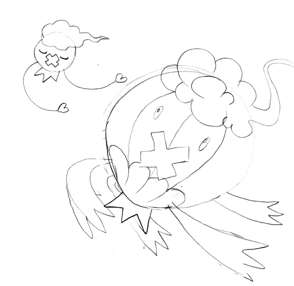
floon
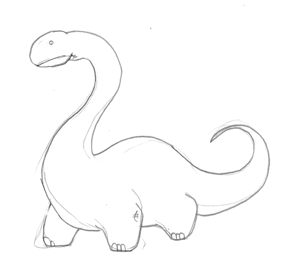
clueless dinossaurI think that Salamence looks fantastic. Good job ^__^
This particularly caught my eye as a very unique piece. I think it's very different, to say the least. I do like it. However, there are a few problems, albeit small. Around the chest, there appears to be a piece of flesh protruding from the left side. It makes the shell, which you obviously spent a considerable amount of time on, look either too small or in the wrong place. With shells (or any item for that matter) that wrap around the abdomen and not the back or sides, you will generally want them to fit the shape of the body exactly. Otherwise it will either make it look like there is excess flesh at either the chest, thighs, or both.
The knees look a bit strange stretched the way they are although the proportions are nearly perfect. The way the thigh on the right side is turned, it nearly looks like there is no distinction between the leg and the abdomen. Nothing major, though.
The neck seems a little... muscular in the back and it seems as though this could have looked a little more precise if the head had been nearly leveled and the neck reduced.
The instrument is a nice touch, but I don't like the shape of it. I think it would look nice if the fingerboard had been shortened, widened, and straightened. The current arrangement isn't bad, but it kind of makes the piece look imbalanced.
And it looked to me like some sort of dinosaur x cow x cello; am I correct?
Overall nice piece, just wanted to comment.Users Who Are Viewing This Thread (Users: 1, Guests: 0)
- ... and 1 more.