
-
Welcome to Smogon! Take a moment to read the Introduction to Smogon for a run-down on everything Smogon, and make sure you take some time to read the global rules.
-
Congrats to the winners of the 2023 Smog Awards!
"Worst Pokémon Ever"
- Thread starter SapphSabre777
- Start date

Fujin and Raijin roll with him for a while but eventually decide "okay this is getting a bit dumb now" as ask your party to beat some sense into Seifer. Dumb like 40% OU usage in a gen with an S-Rank Ice Type.It's a Final Fantasy 8 reference. Character pictured there is Seifer, the main rival and recurring antagonist, who at the start of the game attends the same military academy as you and your other early party members do. During the early game taking place in the academy, Seifer pretty much takes the role of the bully and has two lackies who are named Fujin and Raijin. I haven't played or really seen a playthrough of FF8 so not sure what happens to them after the academy and Seifer joins the main villain, though I do know in the Kingdom Hearts games all three show up in KH2 as teens in the early part of the game once again taking the role of bullies for the player character and their friends (though after that they're shoved to the side as they don't have a role in the main story).
Also if it contributes any to the comparison, Seifer and Co. are specifically the Disciplinary Committee at the School
I actually don’t find Enamorus ugly at all, I find it very quite attractive. I feel that’s it model is a perfect combination of sassiness, fierceness and kindness. And for the reason why Enamorus is female instead of male is probably because they didn’t want to design another genie with the same pose and tail position, because when BW were released a common criticism of the Forces of Nature is that they looked way to similar to each other, with the only the color of skins, tail design and hair style being notably different.I don't think anyone's brought up this Pokemon yet:
First of all, it's been talked to death about how ugly the design is. Its proportions are way too close to human, which makes it look really creepy. The other genies at least have the gumdrop-shaped head which makes them more appropriately monster-like. I feel like I'd hate it at least 20% less if they gave it the same head, arms, and tail shape as the other genies, and I really can't help but feel like it isn't like the others because of sexist reasons.
Second of all, it fits very poorly into the Forces of Nature, and there was no good reason to change the genie storyline. "Love" is pretty clearly not a natural force in the same way that "wind", "lightning", and "earth" are. Maybe it could have worked if they made it "life" instead, but with the pink hearts everywhere that clearly isn't where they were going. The only good thing it really does is complete the "cardinal beasts" set, but that implies some sort of symmetry, which Enamorus does not have due to the fact that its theming and appearance do not fit with the others. They also didn't bother to change the fact that Landorus has a higher BST than the others (due to its position as the "master" of the trio in the original story). Yes, I realize this comes across as just "change is bad". I don't think the original genies story is particularly masterful writing or that none of the old lore should ever be touched. However, the writing they've done with Enamorus is worse than before, and it seems like the only reason it's connected to the genie trio is for nostalgia baiting. (Side note: I dislike Regieleki and Regidrago for much of the same reasons.)
Enamorus is emblematic of so many of the design trends I dislike, from the designers' weird hangups about gender to the legendary churn to the blatant nostaglia baiting with no regard for thematic coherency. I think that makes it easily one of the worst in both design and thematics.

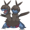
I know that picking garchomp as a worst pokemon design is a very "you just dont like it because its popular lol" take, but its probably one of the most confused and aimless designs on this series imo
Beta garchomp confirms to us the original concept here: the good old sand shark trope. its a shark dragon that fits most ground type color conventions and already had dragon/ground going on for it. While not a favorite, I think the clear and streamlined take while still having some of the earnest and silly charm even when its clearly a cool, tough guy pokemon makes the beta a great design.
but they rehauled it, and while we never got any reasons to why, I think its because they realized sinnoh would not have any desert areas or anything similar to it, hosting only a shallow beach.
I also think this is where garchomps design falls apart. instead of trying to work the sand shark concept into something more novel or just redo the design with a new focus, they just... threw anything hoping it stuck? current garchomp is a shark thats kinda a sandshark but doesnt have any sand to swim on, so its also a jet except it only harkens jets if you squint, because its too much of a shark to let any other inspirations resurface. also, why a jet?? it takes no advantage design, flavor or move wise of being a secret plane that flies around, most likely because this whole design aspect was shoehorned late in development, but nothing else was added to at least give chomp a fun quirk like learning fly. We only got it in recent gens from flying animations in the overworld. And while I think the fact its flying animation looks really stupid is very charming, its hard for me to see it as intentionaly making a clunky plane dragon and more so as creating a design that doesnt suceed in being any of its concepts and looks awkward in most of it.
also... wheres the goofiness? salamence is a cool dragon that also has silly wings and tiny little arms. garchomp had all its earnest charm filled out in swap for trying to max out how cool and tough it is, and all it looks like is a design that clearly got rushed so they just decided to appeal to a shallow sense of coolness. random spikes and teeth and sick colors that fit an action figure more than a pokemon. in fact, garchomps entire execution can be described as shallow, rushed, being hidden under appealing cool traits and nothing else.
i dont think it helps that dragapult took the jet concept and it just looks better AND has a much cooler and fun execution. now we just need a proper sand shark so garchomp can fully be obsolete

I agree they should've given Garchomp opposable thumbsalso... wheres the goofiness
if garchomp could give me the middle finger i think itd be a top 5 designI agree they should've given Garchomp opposable thumbs
I understand where you're coming from, but I'm morally and legally incapable of hating on Garchomp.View attachment 606119
I know that picking garchomp as a worst pokemon design is a very "you just dont like it because its popular lol" take, but its probably one of the most confused and aimless designs on this series imo
View attachment 606120
Beta garchomp confirms to us the original concept here: the good old sand shark trope. its a shark dragon that fits most ground type color conventions and already had dragon/ground going on for it. While not a favorite, I think the clear and streamlined take while still having some of the earnest and silly charm even when its clearly a cool, tough guy pokemon makes the beta a great design.
but they rehauled it, and while we never got any reasons to why, I think its because they realized sinnoh would not have any desert areas or anything similar to it, hosting only a shallow beach.
I also think this is where garchomps design falls apart. instead of trying to work the sand shark concept into something more novel or just redo the design with a new focus, they just... threw anything hoping it stuck? current garchomp is a shark thats kinda a sandshark but doesnt have any sand to swim on, so its also a jet except it only harkens jets if you squint, because its too much of a shark to let any other inspirations resurface. also, why a jet?? it takes no advantage design, flavor or move wise of being a secret plane that flies around, most likely because this whole design aspect was shoehorned late in development, but nothing else was added to at least give chomp a fun quirk like learning fly. We only got it in recent gens from flying animations in the overworld. And while I think the fact its flying animation looks really stupid is very charming, its hard for me to see it as intentionaly making a clunky plane dragon and more so as creating a design that doesnt suceed in being any of its concepts and looks awkward in most of it.
also... wheres the goofiness? salamence is a cool dragon that also has silly wings and tiny little arms. garchomp had all its earnest charm filled out in swap for trying to max out how cool and tough it is, and all it looks like is a design that clearly got rushed so they just decided to appeal to a shallow sense of coolness. random spikes and teeth and sick colors that fit an action figure more than a pokemon. in fact, garchomps entire execution can be described as shallow, rushed, being hidden under appealing cool traits and nothing else.
i dont think it helps that dragapult took the jet concept and it just looks better AND has a much cooler and fun execution. now we just need a proper sand shark so garchomp can fully be obsolete
I understand where you're coming from, but I'm morally and legally incapable of hating on Garchomp.
garchomp itself is meh to me but i would sacrifice myself at the altar of gible so i have simply accepted some first stage mons have bigger and uglier business to eventually attend to
QuentinQuonce
formerly green_typhlosion
Increasingly I find myself liking the middle stages of the pseudo-legends more than the evolved forms.
Zweilous is cool as hell, I honestly find it way more scary and threatening than Hydreigon. Also I played the Harry Potter PC games a lot as a young'un and it reminds me uncannily of the Venomous Tentacula...
Hakamo-o is a far, far superior design to the absolute excess that is Kommo-o. This thing looks like it could actually fight, viciously - it's lean and sleek and athletic and powerful-looking.
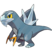
Arctibax again looks more nimble and active than Baxcalibur, which... isn't a bad design, per se, it's just that every render and official artwork makes it look stiff and bulky and cumbersome. There are some great fanworks out there which give it a bit more expression, but it's one of those Pokemon that suffers from being a 3D model. I'm just way more attached to Arctibax, it's both cute and tough.
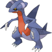
And then there's Gabite. Again, it looks miles more vicious and dangerous than Garchomp - the Pokedex describes it as hunting Carbink and I can absolutely imagine it doing that. And it's one of those mid-stages, like Metang, that comparable Pokemon pale in comparison to: you get one as part of a rental team in PBR and it looks miles more intimidating and powerful than the other mid-stages on your team like Monferno and Luxio.
Also it has a phenomenally better shiny than Garchomp so there's that too.
Zweilous is cool as hell, I honestly find it way more scary and threatening than Hydreigon. Also I played the Harry Potter PC games a lot as a young'un and it reminds me uncannily of the Venomous Tentacula...
Hakamo-o is a far, far superior design to the absolute excess that is Kommo-o. This thing looks like it could actually fight, viciously - it's lean and sleek and athletic and powerful-looking.
Arctibax again looks more nimble and active than Baxcalibur, which... isn't a bad design, per se, it's just that every render and official artwork makes it look stiff and bulky and cumbersome. There are some great fanworks out there which give it a bit more expression, but it's one of those Pokemon that suffers from being a 3D model. I'm just way more attached to Arctibax, it's both cute and tough.
And then there's Gabite. Again, it looks miles more vicious and dangerous than Garchomp - the Pokedex describes it as hunting Carbink and I can absolutely imagine it doing that. And it's one of those mid-stages, like Metang, that comparable Pokemon pale in comparison to: you get one as part of a rental team in PBR and it looks miles more intimidating and powerful than the other mid-stages on your team like Monferno and Luxio.
Also it has a phenomenally better shiny than Garchomp so there's that too.
This is the only one I think I need to chalk up to preference rather than objective criticism (which I'm more comfortable saying since this is a "worst Pokemon" thread rather than say the "Things that Annoy me" one). Baxcalibur is very obviously a reference to Godzilla and similar Kaiju, who because of the suit limitations are often big Bulky entities that barrel through buildings and kinda bowl each other over. The big cumbersome design seems almost intentional and is well reflected in Baxcalibur only being moderately fast but having very high HP and ATK (another Pokemon matching this description being Great Tusk compared to the more agile Iron Treads).View attachment 606237
Arctibax again looks more nimble and active than Baxcalibur, which... isn't a bad design, per se, it's just that every render and official artwork makes it look stiff and bulky and cumbersome. There are some great fanworks out there which give it a bit more expression, but it's one of those Pokemon that suffers from being a 3D model. I'm just way more attached to Arctibax, it's both cute and tough.
I don't think it suffers as much from being 3D because that bigger, stockier look is suited to its theme compared to the weird Bird Posture or something like pre-update Kanto Starters.
QuentinQuonce
formerly green_typhlosion
I agree the stat spread matches its design. However, I maintain that it's a design which would likely look miles better in the spriting era.
An easy comparison is Tyranitar. Tyranitar's RSE and DPP sprites are fantastic, IMO, because they allow it to look expressive and place it in an action pose. Conversely, most of its sprites from BW onward (and in Stadium/ColoXD to boot) are just bland and nondescript. They're a step away from being a plain T-pose.
A sprite would definitely give Baxcalibur more potential to look active and dynamic, but in all the official renders, unless it's literally mid-attack it's just stood stiffly and looks rather awkward. This is not something caused by it being kaiju-inspired. Slowbro still looks great even in 3D.


Baxcalibur definitely feels like an anomaly among the Gen 6-9 Pokemon. Most of the Pokemon introduced in the 3D era with models have designs that really work well with the strengths of a 3D model, which is being able to animate a model in a variety of ways. Dynamic facial expressions, variety of motions like when attacking or defending, and having particularly clean walking/running movements.
Baxcalibur doesn't really have a lot of that. It seems the main aspect of its design that shines in a 3D model is Glaive Rush, which involves the use of its rear blade, showcasing the unique front flip, using its icy breath to propel itself, and Baxcalibur impaling its opponent with its dorsal blade in action.
That said, some of the other pseudo-legendaries introduced in the 3D era have more things about their designs that shine best in 3D, particularly Kommo-o and Goodra.
Goodra for instance has a very expressive face: it's very cute to start, but its face is very capable of dynamic expressions: it can look happy, it can look sad, angry, battle-ready, and whatnot. And it looks good in a model because a model can show its slime dripping and also showcase it in action in a variety of ways, such as flipping its horns or swinging its tail when using moves like Power Whip or Aqua Tail and whatnot. Things like this:


And then there's its Amie expressions, which especially compared to previous pseudos, for Goodra its facial expressions are very dynamic and lively.
Meanwhile, Kommo-o doesn't have the expressiveness of Goodra, but since Sun and Moon introduced walking/running animations for models, trying to showcase them in even fuller motion, Kommo-o really shines there.
For one, its walking and running animations are *super* clean. Something like Tyranitar looks stupid when in motion because it was designed to look good in a stationary pose, but Kommo-o looks really good when walking or running.
Meanwhile another big instance where Kommo-o's design shines is its signature Z-Move, which it was among the few fortunate to get one. Kommo-o looks absolutely magnificent here: the Z-Move really shows off its clanging scales in action and it looks like a full on dance, which is a sight to behold.
The most recent pseudo-legendaries before Baxcalibur also shined in SwSh and PLA thanks to their signature moves which are specifically animated around their design aspects. Dragapult's Dragon Darts shooting Dreepy or Hisuian Goodra tucking into its shell.
In general a lot of newer mons shine with a 3D model but Baxcalibur does strike as a bit awkward in that regard. Its only real trait that shines in 3D is the ability to front flip with Glaive Rush to use its dorsal blade, but otherwise the mon while imo a nice mix of tough looking a cute tends to look a tad stiff. Fortunately it has been shown in some good poses, like this:

I will say, I do think Baxcalibur is overall more expressive in its face than Tyranitar which I think can shine a bit in a model, but yeah it does feel a lot more like a Gen 1/2 type of design than a modern one.
If I'm honest I think the Beta design looks badView attachment 606119
I know that picking garchomp as a worst pokemon design is a very "you just dont like it because its popular lol" take, but its probably one of the most confused and aimless designs on this series imo
View attachment 606120
Beta garchomp confirms to us the original concept here: the good old sand shark trope. its a shark dragon that fits most ground type color conventions and already had dragon/ground going on for it. While not a favorite, I think the clear and streamlined take while still having some of the earnest and silly charm even when its clearly a cool, tough guy pokemon makes the beta a great design.
but they rehauled it, and while we never got any reasons to why, I think its because they realized sinnoh would not have any desert areas or anything similar to it, hosting only a shallow beach.
I also think this is where garchomps design falls apart. instead of trying to work the sand shark concept into something more novel or just redo the design with a new focus, they just... threw anything hoping it stuck? current garchomp is a shark thats kinda a sandshark but doesnt have any sand to swim on, so its also a jet except it only harkens jets if you squint, because its too much of a shark to let any other inspirations resurface. also, why a jet?? it takes no advantage design, flavor or move wise of being a secret plane that flies around, most likely because this whole design aspect was shoehorned late in development, but nothing else was added to at least give chomp a fun quirk like learning fly. We only got it in recent gens from flying animations in the overworld. And while I think the fact its flying animation looks really stupid is very charming, its hard for me to see it as intentionaly making a clunky plane dragon and more so as creating a design that doesnt suceed in being any of its concepts and looks awkward in most of it.
also... wheres the goofiness? salamence is a cool dragon that also has silly wings and tiny little arms. garchomp had all its earnest charm filled out in swap for trying to max out how cool and tough it is, and all it looks like is a design that clearly got rushed so they just decided to appeal to a shallow sense of coolness. random spikes and teeth and sick colors that fit an action figure more than a pokemon. in fact, garchomps entire execution can be described as shallow, rushed, being hidden under appealing cool traits and nothing else.
i dont think it helps that dragapult took the jet concept and it just looks better AND has a much cooler and fun execution. now we just need a proper sand shark so garchomp can fully be obsolete
I hate that style of Pokemon design tbh, it looms at most derpy and lame to me, zero hint of Cool
And I'm not a Garchomp/coolguy mcgee lover, my favorite Dragon Types are cute/weird ones like Altaria/Mega Altaria
mega altaria is absolutely not a weird pokemon, its a pretty cute standard easy merch monAnd I'm not a Garchomp/coolguy mcgee lover, my favorite Dragon Types are cute/weird ones like Altaria/Mega Altaria
altaria is only weird in the sense that it's dragon type rather than any other type along with flying (which i love; the dragon type sometimes denoting a concept rather than physical traits is something they should try more often with fellow mostly-physical-trait type bug). otherwise a cute cloud birb is a very straightforward idea
in the west especially, Dragons are seen as something that has to be cool, and cool is seen as better than cutemega altaria is absolutely not a weird pokemon, its a pretty cute standard easy merch mon
cute things are weird when its on an archetype that people are frankly on average against associating with cute
also i remember your shit about "merch" stuff , weird pokemon also get tons of merch. your tastes are not cooler because you don't like traditionally cute or cool designs, and if weird designs did not make for good merch/advertising, they literally would not be made
Not... really? I've seen plenty of cute dragon things throught the years. cute dragon toys, plushies, appearing in games, movies. sometimes even cool dragons will be designed to have cute moments because people Know theres an appeal in a dragon actually being a cute puppy/cat thing (see toothlest in the 2010s). Cute dragons are not some random niche, they're pretty popular!in the west especially, Dragons are seen as something that has to be cool, and cool is seen as better than cute
cute things are weird when its on an archetype that people are frankly on average against associating with cute
i like traditonally cute and cool designs, one of my favorite pokemon is probably one of the most popular starters (mudkip). I also just know theyre conventional and not that weird, and trying to act like they are just feels defensiveness. I think scyther rips, and that thing was made with 0 brainpower beyond what if a mantis ruled really hard. I also know when a design i like is playing on tropes that make it more conventionally "cool" or "cute" vs when its more of a weird beastalso i remember your shit about "merch" stuff , weird pokemon also get tons of merch. your tastes are not cooler because you don't like traditionally cute or cool designs, and if weird designs did not make for good merch/advertising, they literally would not be made
and the second point: yeah? this is pokemon, they'll try to wring out merch of every pokemon (literally @ sitting cuties). but it is pretty obvious when a design is made because it'll hit every point of a perfect merch (wooloo, yamper, snom, like all the gen 9 dogs, most starter first forms tbh ever since gen 3 but especially after gen 6) vs a design that wasnt for merch but it'll get one anyway, either because it got popular or just because its pokemon and they can sell anything and people will buy it.
tl;dr: calm down
also my tastes are objectively better because i like turtonator. turtonator sweep
I don't agree and you won't convince me. I've seen this fandom for literally over ten years at large suck off the masculine Pokemon that are just cool and edgy, and see cute Pokemon as either jokes or something that no one should really care about.Not... really? I've seen plenty of cute dragon things throught the years. cute dragon toys, plushies, appearing in games, movies. sometimes even cool dragons will be designed to have cute moments because people Know theres an appeal in a dragon actually being a cute puppy/cat thing (see toothlest in the 2010s). Cute dragons are not some random niche, they're pretty popular!
i like traditonally cute and cool designs, one of my favorite pokemon is probably one of the most popular starters (mudkip). I also just know theyre conventional and not that weird, and trying to act like they are just feels defensiveness. I think scyther rips, and that thing was made with 0 brainpower beyond what if a mantis ruled really hard. I also know when a design i like is playing on tropes that make it more conventionally "cool" or "cute" vs when its more of a weird beast
and the second point: yeah? this is pokemon, they'll try to wring out merch of every pokemon (literally @ sitting cuties). but it is pretty obvious when a design is made because it'll hit every point of a perfect merch (wooloo, yamper, snom, like all the gen 9 dogs, most starter first forms tbh ever since gen 3 but especially after gen 6) vs a design that wasnt for merch but it'll get one anyway, either because it got popular or just because its pokemon and they can sell anything and people will buy it.
tl;dr: calm down
also my tastes are objectively better because i like turtonator. turtonator sweep
Look at how much fanart is made of Garchomp compared to Altaria, and Mega Altaria, combined. You can compare it to practically every "cool" Dragon mon, and it will be less. Because yes, that guy who picked Charmander because "woahh fire dragon!!!" is still the silent (is it even that silent?) majority of the fandom.
And majority rules on what is weird or not.
And majority rules on what is weird or not.
my chart will never not be outdated

I find it hard to believe that I heard anyone calling Weavile, Aggron and Scolipede being underrated.
What’s the bottom of the image?
I find it hard to believe that I heard anyone calling Weavile, Aggron and Scolipede being underrated.
What’s the bottom of the image?
the full thing but id put chandelure at the top because apparently not only is it vogue ppl are OBSESSED with that thang. I have favorites in every part :) (not pictured on it but stuff like bulbasaur would be in the second one no questions asked, i just wanted to hit the top 5 powerhouses LOL)
Also this meme was actually made because someone made a post asking for peoples unpopular pokemon taste and every pokemon i put in the top was called underrated and i thought it was really really funny. i love toxicroak aggron scolipede and absol (flygon good but vibrava peak) but we gotta be real here. these are not unpopular mons
I get the “every Pokémon have their favorite” but unpopular mons do exist.View attachment 607326
the full thing but id put chandelure at the top because apparently not only is it vogue ppl are OBSESSED with that thang. I have favorites in every part :) (not pictured on it but stuff like bulbasaur would be in the second one no questions asked, i just wanted to hit the top 5 powerhouses LOL)
Also this meme was actually made because someone made a post asking for peoples unpopular pokemon taste and every pokemon i put in the top was called underrated and i thought it was really really funny. i love toxicroak aggron scolipede and absol (flygon good but vibrava peak) but we gotta be real here. these are not unpopular mons
Unpopular mons having lot less fanarts than the “hated” ones and being just forgettable.
sure, none of the pokemon mentioned here are unpopular though. they have plenty of fans and plenty of fanart!I get the “every Pokémon have their favorite” but unpopular mons do exist.
Unpopular mons having lot less fanarts than the “hated” ones and being just forgettable.
id say unpopular mons that arent hated would be things like sawsbuck, zebstrika, cherrim, chingling/chimecho etc.

In terms of popularity I don't think anyone would say these are underrated, but in competitive battle on the other hand a lot of these guys fall into UU, RU, and even NU.