CAP 13 CAP 2 - Sprite Submissions

Status
Not open for further replies.
Alright, despite many shenanigans, I think I'm satisfied with this backsprite now. I also made some changes to the frontsprite.


I'll wait for CC if anyone has some to give, make edits, and then I think I'll final submission this bad boy up, since I already have shiny colors. Actually, maybe I should post those here too...

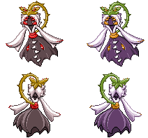
Well, here's the frontsprite at least, for CC. Actually, I'm not sure I like these colors at all... The gold seems out of place.
 
elementalpenguin, I'd like to point out that your light source on your backsprite isn't accurate to the games and looks pretty odd when side by side other backsprites. Your source is behind the 'mon when all official 'mons have it high up in front.

Example:


You can see that the back of this Samurott is lit from the front, masking most of the 'mon in shadow. It makes sense because the backs mimic the front sprites down to the lighting itself.
 

Quanyails

On sabbatical!
is a Top Artist Alumnusis a Community Leader Alumnusis a Community Contributor Alumnus
Submission so far (Final Submission if I don't edit it further):


Do I need to separate each sprite into its own 96 x 96 box?

A comparison of my sprite with other large B/W sprites:


Still seems a li'l tall compared to other sprites (darn that head-leaf), but at least it doesn't take up the entire length.
 

Snorlaxe

2 kawaii 4 u
is a Top Contributor Alumnus
i really like it quanyails! it looks great side-by-side with the official sprites, which is always a good sign :)
 
Oh dear! Thank you, Wyv. I must admit to having never actually done a backsprite before, aha... Well then, I'll do that right now. Thank you so much, it would have been awful to submit that sprite.
 
I might enter if I find the time for it...
I'll start with the front sprite and if people like it I'll add the backsprite.

Aragornbird: I love yours, I sertainly love the shading. One minor bad thing: the placement of the vine doesn't seam natural to me. I thing it should be more to the left.

Elementalpingiun: I like yours too. But I really don't like your shading on the front sprite.
 
Uh... While I appreciate the feedback, if you could tell me what exactly you dislike it would be very helpful to me. Thanks!


Changed gray shades, made the dress less bulky, removed the highlight on the dress. I'm tempted to just throw in the towel here - I didn't give myself enough room on the front-sprite, which made the shading less stark and not very 5th-gen-ish, and I'm not sure I can fix that now... or that I want to. Oh well. All CC still welcomed, I haven't given up yet.
 
Alright, that seems like the thing I've been noticing about the shading being too complex and not very cel-shaded, as many 5th gen sprites are. I'll work on making it into more simple shapes soon. Thanks!
 
here is my entry:

I tried to make it more of a shy-maid-pose because I think it fits CAP2...
So comments? Should i bother making the back sprite?
 

Stratos

Banned deucer.
@ elementalpenguin,

when you look at the teeth on the official drawing, they're more of an embossment or embroidery, and yours have a fairly large shadow, which makes it appear as if they're sticking out from the dress instead of sideways. Were I you, I would eliminate the shade patches completely, but at the very least you should shrink them.
 
Pwnemon: Since other people have commented saying they liked it and I made the decision myself that I would have them be actual teeth rather than just thin slips, I think I'll keep it. Thanks for the CC, though - I may change my mind now that it's something I'm paying attention to.
 
@Elementalpenguin. Your sprite seems to be my favorite (lurker) and just a small amount of feedback, the left arm on the backsprite is a little thicker then the right armof the backsprite. Maybe a bit more balance regarding the two?
 

DougJustDoug

Knows the great enthusiasms
is a Site Content Manageris a Top Artistis a Programmeris a Forum Moderatoris a Top CAP Contributoris a Battle Simulator Admin Alumnusis a Smogon Discord Contributor Alumnusis a Top Tiering Contributor Alumnusis an Administrator Alumnus
Moderator
Minor update to my sprites:


I agreed with the feedback about the backsprite arms being too straight, so I tried to make them a little more curved and consistent with the arms of the front sprite.
 
@DJD looks very nice. great pose, but the shadings look very unnatural. it seems like its a faded pop up sticker, if you know what i mean
 
Final Submission since there didn't seem to be much else that was within my power to change; other than fix that thorn that was different from all the others. Backsprites stay the same.


best of luck everybody!
 
Final Submission


Well I was a bit scared for a while because I went away for 10 days and thought that I missed the deadline

Anyways, I think the sprite is really good. I was trying to make the sprite look as close as possible to a real 5th gen sprite. I made a neutral pose that looks at the Pokemon straight on rather than leaning up or down. The same goes for the back-sprites. The shading is all very bold just like in the games, no smooth shading. So for me my biggest selling point is being very close to the real in game sprites. After this I think that the only thing I would do is make the light source on the back-sprite and front-sprites higher up, as they are in game.

As many other people are doing I will also put in some sprites for size comparison.


good luck to the other entries
 
@DougJustDoug Something about the colors doesn't really convince me. They seem like they should be a couple shades darker. As it is, it looks a bit glossy. But other than that, it's a great sprite.

@Aragornbird I really love your sprite. It definitely has that Gen V feel to it. The rips by the teeth on the dress seem a bit odd though. And the very bottom right edge of the dress seems a bit blunted; it's a small detail. Aside from that, you have an amazing sprite. I can definitely picture this as an animated sprite.
 
Status
Not open for further replies.

Users Who Are Viewing This Thread (Users: 1, Guests: 1)

Top