Smeargle's Studio Update
| « Previous Article | Home | Next Article » |
Introduction
What's up? ium here, and even though it's just the beginning of 2013, we've already had booming activity in Smeargle's Studio! Danmire just wrapped up the Monthly Art Contest, and I'm sure you want to see the winning pieces, centered around heroism this time. RitterCat also gave the Weekly Spriting Contest a jump start, which garnered amazing work from the often-forgotten spriters that Smogon has to offer. In addition, icepick started a new community project to create a deck of playing cards, and this update will be sure to feature some of the great submissions so far! Finally, who could forget the Smeargle's Studio Secret Santa that happened during the recent holidays? You can expect to see some pieces from there too!
To get a grasp of the unique opinions that each person has to offer, these updates will be featured by both RitterCat and myself. Of course, my commentary is represented by Skuntank, and RitterCat's is indicated by Purugly.
Contests
MAC #21 – Heroism
1st Place – Yilx

2nd Place – Bummer
3rd Place – RitterCat

Yilx's piece is an exemplary depiction of a heroic act. As usual, it's the details, such as the lighting and the warm and red tones, that really stand out in this piece. Another thing to note is the stark contrast between light (which reflects off Meloetta and Kirlia) and darkness in the background to metaphorically relate to good and evil. I really like how there are two established light sources, the white and the red, to emphasize the polarity between heroism and villainy. Finally, the Meloetta's muscularity and the Tyranitar's battered appearance are slightly exaggerated, which adds a small element of humor to the piece. This is another great entry by Yilx, and it's no surprise that it's among the top.
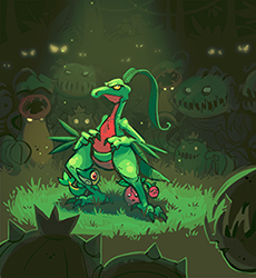
Meanwhile, Bummer's piece is rather interesting since it's prominently green and yellow, but still has contrasting elements presented throughout. That's probably my favorite part; I love how Bummer used mostly analogous colors and shades of green, yet was still able to establish a contrast between light and dark. The Pokemon in the shadows look very menacing, and Bummer emphasized it by making their eyes shine in an eerie way with a glowing yellow. At the same time, Grovyle is established as the centerpiece, and even more so by also being shone in the spotlight. Lastly, by having the Snivy and Cherubi cling onto Grovyle with petrified, fear-stricken faces, Grovyle is clearly shown as the hero. Bummer's piece is definitely deserving of the high amount of votes it received.
Finally, there is RitterCat's piece, which makes an interesting use of the night sky to impart light on the hero, Growlithe, instead of shadows. Ritter gives Growlithe and Vulpix clear details by using saturated colors and bright blue highlights. On the other hand, the villainous subjects are shown as silhouettes with their backs facing front, yet their entire bodies are not visible. That adds a whole element of mysteriousness and allows the Growlithe to be the centerpiece. I appreciate how Ritter clearly showed the expressions on the Pokemon; the Vulpix is depicted as helpless and the Growlithe looks protective and courageous. RitterCat has done an excellent job with this piece, and it stays true to his style while being relevant to this MAC's theme.

Yilx's entry has everything we expect of a Yilx piece: beautiful lighting and shading, a stunning background, and a Meloetta or Kirlia featured in some way. Yilx's use of lighting and color to emphasize heroism through contrast was already explained well by ium, but I feel the choice of Pokemon themselves really adds to his take on the theme. At first glance, the use of typings seems quite obvious, with a Fighting-type rescuing a Psychic-type from a Dark-type. However, as Meloetta's base forme is actually part Psychic, not Fighting, it shows a heroic transformation to save a fellow Psychic-type. Added to this is the fact that Meloetta only changes forme in battle with Relic Song, so it risked being attacked by the Dark-type Tyranitar while still Psychic, but stayed in the battle, bravely turned into a Fighting-type, and saved Kirlia. In addition to this, their petite feminine bodies stand in contrast to the big, monstrous Tyranitar and show the small Pokemon triumphing over the large. I'm probably reading far too much into this, but it's a cute story that shows heroism really well, and even more reason why Yilx truly deserved the number one spot.
Bummer's piece is another great example of the use of contrast in lighting, with the bright lighting on Grovyle and the dull coloring of the Grass-types in the background clearly pitting good against evil. And while, as ium said, the piece is very green and yellow, the touches of red, especially on the heroes, helps stop the piece from being swamped by a green overload. And once again, I find the use of Pokemon to be symbolic of good and evil. The background Pokemon consist of a part Poison-type, a Pokemon who evolves into a part Dark-type, and a Team Rocket Pokemon from the anime—not the nicest bunch. In contrast, the hero is a starter Pokemon, a kind Pokemon that serves to assist young Trainers and stay as their partners, and it is protecting another starter Pokemon and one whose theme is that it benefits in the sun. I'm probably grasping at straws for some of these links, but these little details are fun to notice and really add onto the beautiful art that Bummer has provided.
Weekly Spriting Contest
Recently, the Weekly Spriting Challenge has undergone a few changes in structure. The strict weekly deadline has changed to a more flexible time period that can be extended or shortened depending on entries. Also, instead of weekly themes, we have two challenges running simultaneously—one by me and one by my co-host, Rodan—to give competitors more choice. Finally, our weekly winners are now just selected by Rodan and me, and winning gives you a point that goes towards an overall leaderboard. Here are a few of the best sprites from the new and improved Weeklyish Spriting Challenge.
Challenge #1 Winner: SubwayJ

With his humorous fusion, SubwayJ was the winner of the very first challenge, a fusion between a Pokemon less than one meter in height and a Pokemon more than three meters in height. This fusion cleverly meshes Solosis and Onix, with Solosis's body style working well on the segmented body of Onix. The sprite isn't perfect, with the line art coloring on the balls inside the sprite changing abruptly from black to a lighter shade, but is a funny, solid first winner to kick off the challenge format.
Challenge #4 Winner: Quanyails

This fusion was the winner of the fourth challenge (by Rodan), where you had to fuse two alternate formes. Quanyails—well-known already as a great spriter and artist in Create-A-Pokemon—shows she knows her stuff when it comes to fusions, too. From the differences between the two, it seems a Landorus-T and Giratina-O fusion would be tricky to pull off, but Quanyails does it perfectly, placing just enough of Giratina-O's features onto the Landorus-T base to make it natural, while both of the used Pokemon are easily able to be identified.
Challenge #6 Entry: Quanyails

The last sprite, again by Quanyails, is actually for one of the challenges that is open currently, a challenge of Rodan's where you have to fuse a Solrock with any number of Pokemon whose ability benefits from the sun. In this sprite, Quanyails changes Tropius from the banana dinosaur we all know and love to a cherry blossom warrior. Solrock serves excellently as head spikes, Shiftry's coat is cleverly used as a cape, and Cherrim's cherries and flowers combined with the cute, bright color scheme finishes the transformation from banana to cherry blossom. However, Quanyails can still be challenged with entries open, so head over to the thread and enter this or the other open challenge to have fun and maybe get your name on the leaderboard!
Contributions
Smeargle's Studio Card Project
SnowPeashooters
icepick

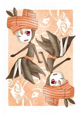
It's always great to see new artists and their unique styles pop up in Smeargle's Studio once in a while. It's even better when these new artists instantly jump into community projects and make their own contributions, which is what SnowPeashooters has done here. This Meloetta piece, representing the queen of diamonds, looks elegant and charming. While this card doesn't have the most unique representation of the queen of diamonds, SnowPeashooters added a lot of intricacy into this piece by adding a grainy texture and swirled diamond patterns. The palette is warm throughout, utilizing orange-tinted reds and blacks to harmoniously complement Meloetta's headpiece. Finally, SnowPeashooters stays true to the nature of playing cards by keeping everything—the pattern, the background, the Meloetta—symmetrical. If you ask me, the combination of the colors and texture is probably my favorite part of this piece because it gives an amazing vintage appearance. It's truly a majestic piece; kudos to SnowPeashooters, and it's great to have such a talented artist aboard at Smeargle's Studio!
The Smeargle Card Project has been filled with many great pieces, but it's fitting that one of the best is still the one that kicked it off, from the project founder and master of painting, icepick. This piece features his trademark beautiful use of colors and brushwork to build up a rich, detailed picture without the need of line art. The background is made up of strong brush strokes, with blue, greens, reds, and whites overlapping to expertly create mountains and a cloudy sky, with the defined lines giving it a rugged look. Even the beam from Bulbasaur's back isn't a solid block of color, but lines overlapping and combining with the background, letting through its color while still clearly portraying a beam of light.
The white outline around Bulbasaur's spade-shaped bulb and the brighter lighting on his face immediately draws your attention when you first look at the picture. This shows you that it is a spade upon first glance, and then the beam of light takes your attention to the sky and background, letting you admire its beauty. The very foreground is left relatively dark, but if you look you will see little Bulbasaur both there and to the side behind the main Bulbasaur.
Finally, while the piece is dominated prominently with blues and greens, icepick uses subtle reds to provide contrast. There are reds in the mountains, in subtle lighting on the Bulbasaur, and in your immediate point of focus, in Bulbasaur's eyes. Once again, icepick has shown why he's one of the best artists on the site and given a strong start to a thriving project.
Smeargle's Studio's Third Annual Secret Santa
From: ToxicPhox
To: CyzirVisheen
"a Metagross doing anything cool"
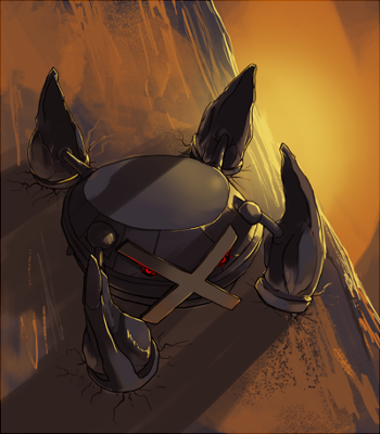
ToxicPhox's art is great in all respects, from posing to line art, but it is really exceptional in use of color, lighting, and shading. This badass Metagross is no different. The contrasting color scheme of orange/blue works really well and is perfectly executed. The background, while predominantly orange, has blues throughout giving depth, and differing hardness and style of brushes are used to create the texture of the rock. The mainly blue Metagross is lit with orange/yellow light, alternating between soft lighting and the strong yellow highlights, clearly showing Metagross as metallic.
For the Metagross itself, its strength and power is shown clearly through its hulking pose, placement in a harsh, rocky environment, and little details like the cracks in the ground around its legs. The bright red of its eyes stands out against the blue/orange color scheme and brings focus on the Metagross.
ToxicPhox certainly delivered this Christmas, and lucky CyzirVisheen for getting this beautiful Secret Santa gift!
From: Birkal RitterCat
To: Mekkah
"let's see a gible decorating a christmas tree"

When you participate in Secret Santa, you don't want to be that jerk who doesn't get the request done. Of course, it's bound to happen every year, and who else would be this year's neglectful ditcher other than Smogon's beloved Birkal? This not-so-nice-guy decided to rob Vader from his title as the Grinch and not do a drawing featuring Gible decorating a Christmas tree as per Mekkah's request. While this issue could have easily been fixed by having Mekkah remove Birkal's newly-acquired super moderator status and/or ban him from the forums, RitterCat came to the rescue and took the initiative to finish Mekkah's request. Now that's the holiday spirit!
What become of Birkal, you ask? Well, he was shamed, called himself the worst (again), and tried to make amends by being apologetic and offering Mekkah a free request. However, we all know that that "offer" is totally bogus and will never happen within the next millennium. It's okay, Birkal; better luck next year.
But enough about him. This piece, done by RitterCat and not Birkal, is executed to perfection. Ritter drew Gible gnawing on the decorated Christmas tree in an adorably menacing manner while paying attention to certain details. The pine texture adds more to the tree's shadows and lighting, while the dead hanging Rotom and text-engraved ornaments rightfully pokes fun at Birkal. I personally love the exaggerated, large jaws of Gible in proportion to its stubby arms and legs—it's cute! The cartoon-esque presentation of Mekkah's request makes the drawing whimsical and fun, which is definitely characteristic of RitterCat's art. It's a well-done piece, and huge props to RitterCat for doing more work than necessary!
| « Previous Article | Home | Next Article » |